Health+
A calm, easy-to-use design sprint concept that brings your prescriptions, telehealth, and wellness shopping into one clean place, with a single, unified checkout that ties the whole experience together.
This sprint focused on reducing friction, simplifying tasks, and making healthcare feel more approachable.
Assumptions
People don’t want to manage multiple accounts, apps, or carts for basic health tasks.
A unified checkout can make healthcare feel smoother and more modern.
A friendly visual style helps reduce anxiety around health management.
Most actions should be fast, clear, and doable in just a couple taps.
Constraints
Designed as a fast, self-guided sprint with no engineering constraints or formal research.
Scope kept intentionally tight to explore core features, not build a full platform.
Visual and interaction patterns needed to stay simple and predictable.

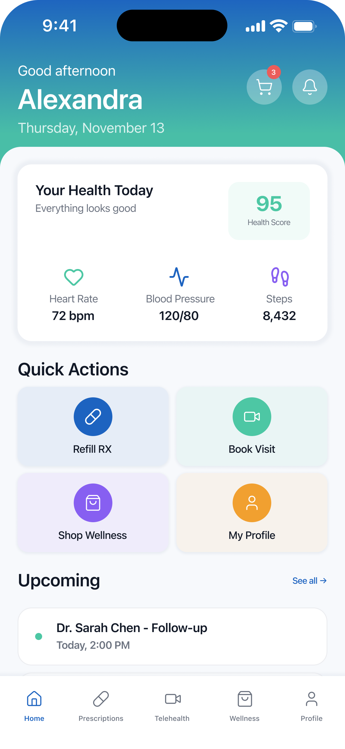
Home —
Your Day at a Glance
Users get a simple overview of their health, plus quick actions for the things they do the most: refills, visits, and managing their wellness needs.
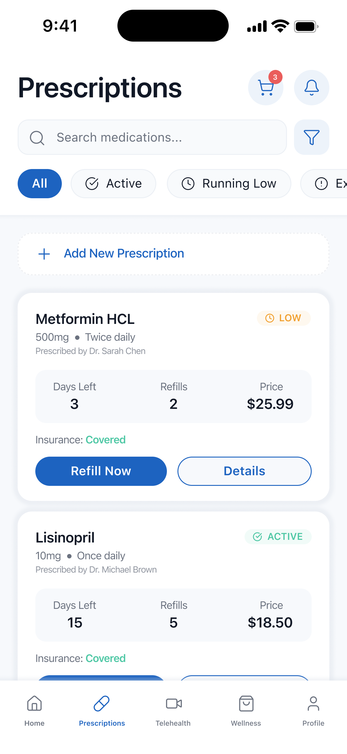
Prescriptions —
Stress-Free Medication Management
Refills, coverage, and pricing are laid out clearly so users always know what’s running low and what’s covered — no digging or second-guessing.

Telehealth —
Appointments Made Easy
Users can browse doctors, schedule visits, and join appointments with almost no friction, keeping care accessible and convenient.
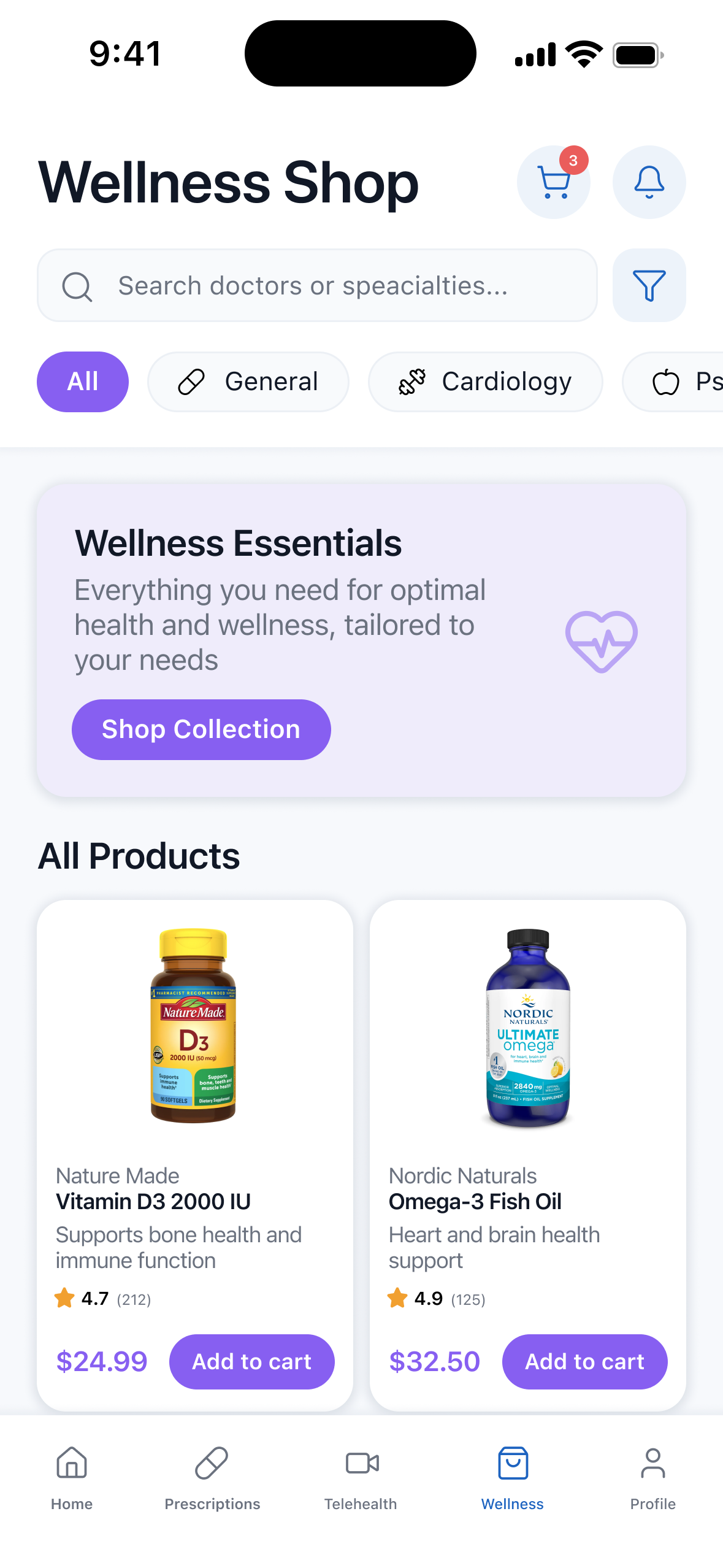
Wellness Shop —
Everyday Health, Curated
A clean browsing experience for vitamins and wellness essentials makes it easy to support long-term health, not just urgent needs.
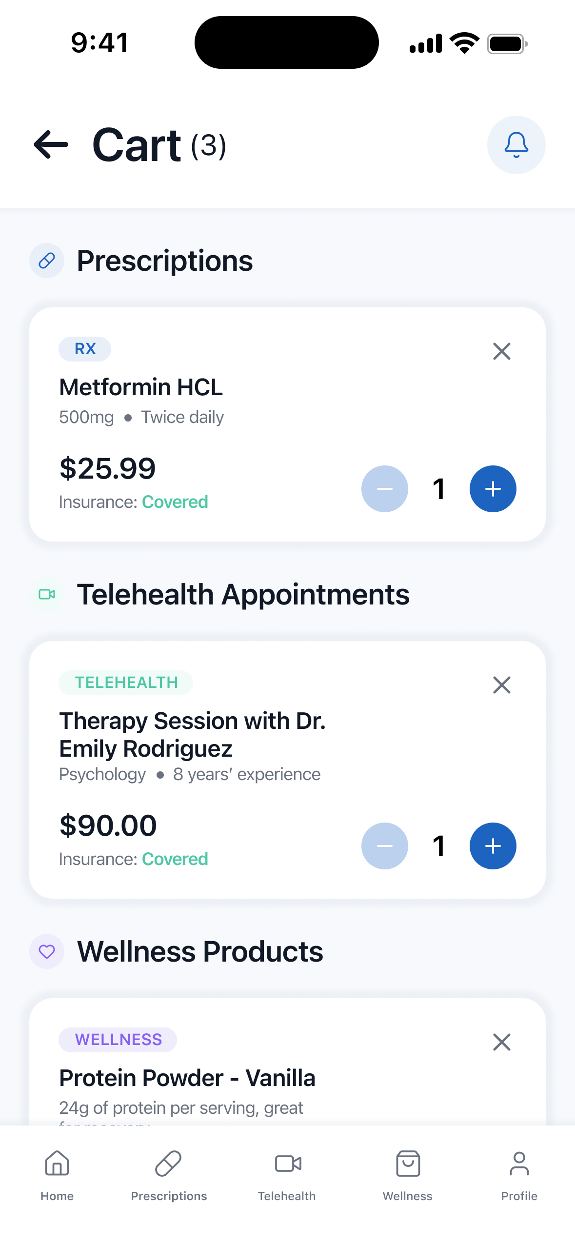
Unified Cart —
One Checkout for Everything
This is the heart of the concept: prescriptions, telehealth sessions, and wellness products all live in one organized cart. Users can review everything at once and check out in a single flow, removing the stress of jumping between different systems.